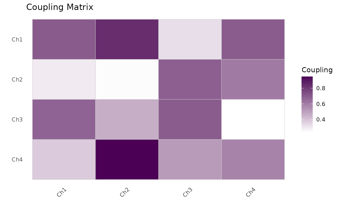
Displays a matrix of coupling values (e.g., coherence between all channel
pairs) as a colour-coded heatmap using ggplot2::geom_tile().
Usage
plotCouplingMatrix(
  mat,
  title = "Coupling Matrix",
  low_colour = "white",
  high_colour = PhysioCore::physioPalette(2, "sequential")[1],
  ...
)
Arguments
- mat
Numeric matrix of coupling values. Row and column names, if present, are used as axis labels.
- title
Character string for the plot title (default
"Coupling Matrix").- low_colour
Character colour for the low end of the scale (default
"white").- high_colour
Character colour for the high end of the scale (default: the dark end of the colorblind-safe sequential palette,
PhysioCore::physioPalette(2, "sequential")[1]).- ...
Additional arguments passed to
ggplot2::theme().
References
Wickham, H. (2016). ggplot2: Elegant Graphics for Data Analysis. Springer-Verlag New York. doi:10.1007/978-3-319-24277-4