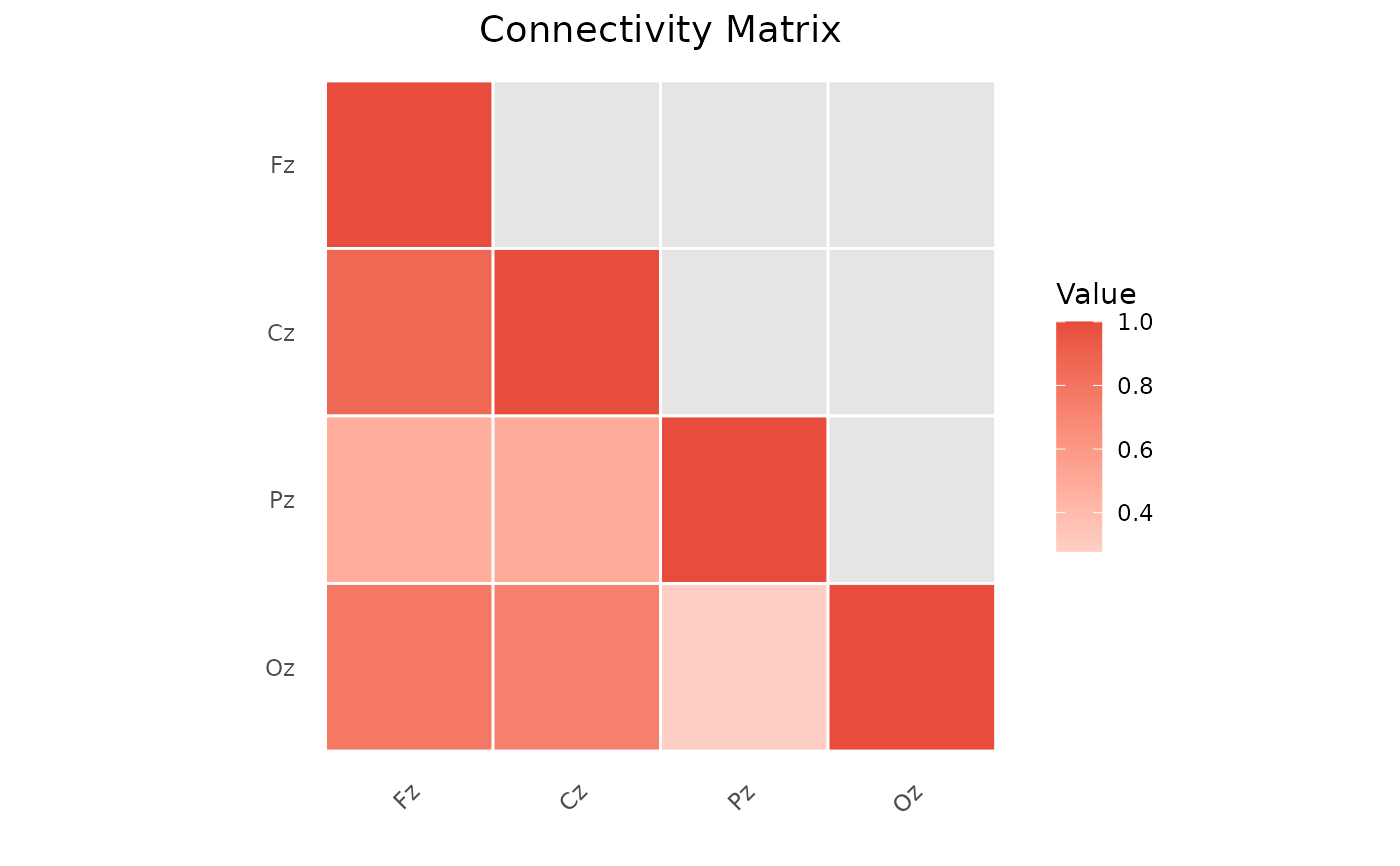
Creates a heatmap visualization of an adjacency or connectivity matrix.
Usage
plotAdjacencyMatrix(
  adjacency,
  node_names = NULL,
  symmetric = TRUE,
  color_palette = "default",
  show_values = FALSE,
  title = "Connectivity Matrix"
)
Arguments
- adjacency
An adjacency matrix or connectivity result.
- node_names
Optional vector of node names.
- symmetric
If TRUE, only shows lower triangle.
- color_palette
Color palette: "default", "viridis", "heat", or custom.
- show_values
If TRUE, displays values in cells.
- title
Plot title.
Examples
set.seed(123)
adj <- matrix(runif(16), 4, 4)
adj <- (adj + t(adj)) / 2
diag(adj) <- 1
plotAdjacencyMatrix(adj, node_names = c("Fz", "Cz", "Pz", "Oz"))