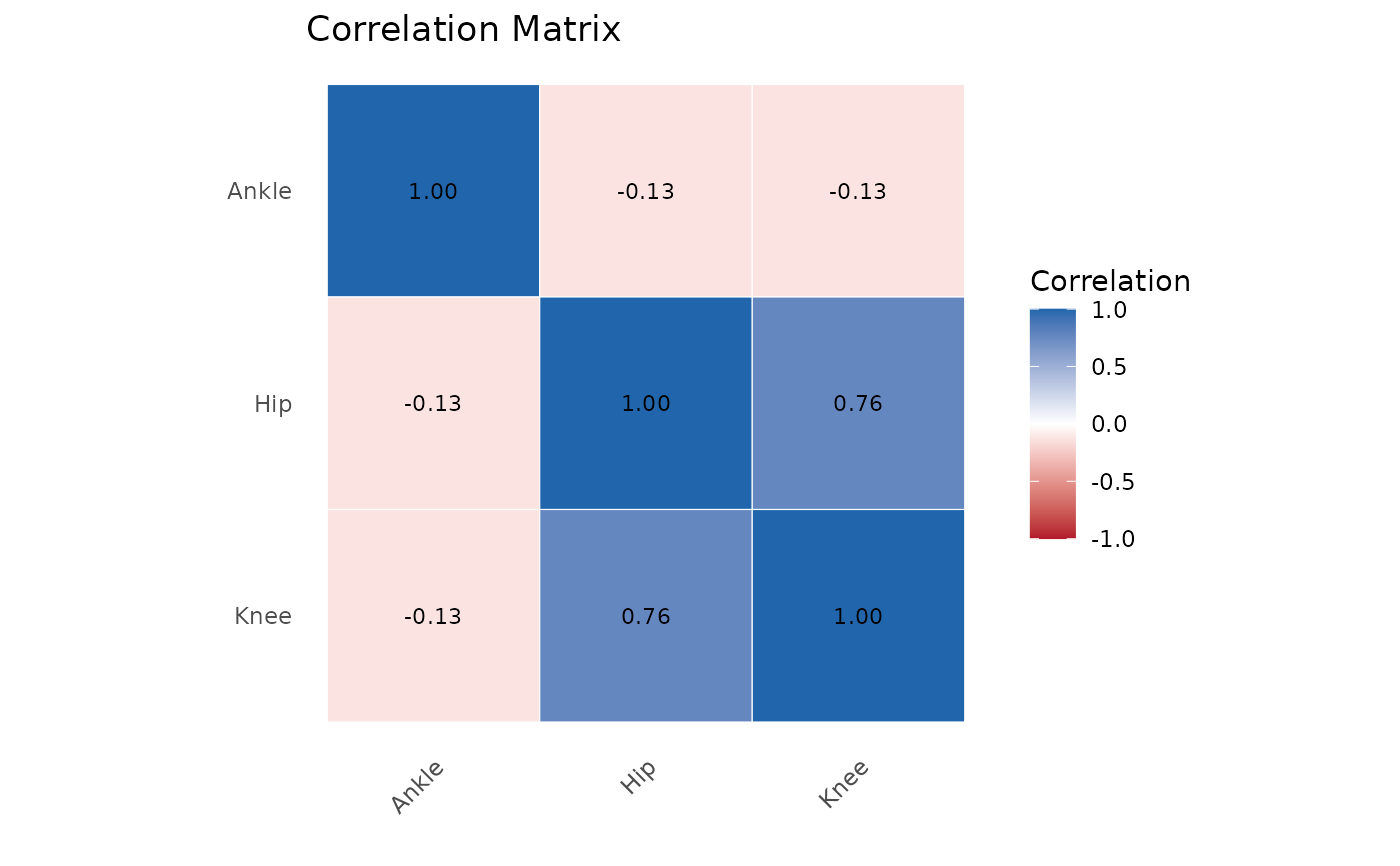
Creates a heatmap visualization of a correlation matrix with optional clustering and significance masking.
Usage
plotCorrelationMatrix(
  x,
  method = "pearson",
  cluster = TRUE,
  show_values = TRUE,
  show_significance = FALSE,
  alpha = 0.05,
  colors = c("#B2182B", "white", "#2166AC"),
  title = "Correlation Matrix"
)
Arguments
- x
A correlation matrix, data.frame, or PhysioExperiment.
- method
If x is data, correlation method: "pearson", "spearman", "kendall".
- cluster
Logical; apply hierarchical clustering to reorder.
- show_values
Logical; display correlation values in cells.
- show_significance
Logical; mask non-significant correlations.
- alpha
Significance threshold for masking.
- colors
Color palette (low, mid, high).
- title
Plot title.
See also
plotEffectSizeForest() for forest plots of effect sizes,
plotWaveformComparison() for comparing waveform patterns across groups.