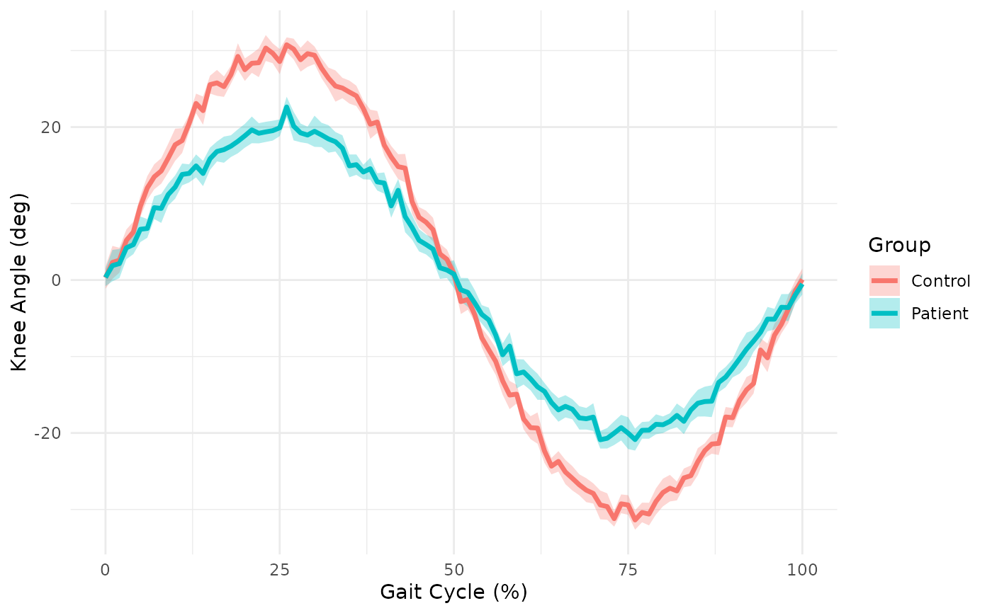
Creates a comparison plot showing mean waveforms with confidence bands for multiple groups. Ideal for comparing gait patterns between conditions.
Usage
plotWaveformComparison(
  x,
  groups,
  channel = 1L,
  ci = 0.95,
  show_individual = FALSE,
  time_axis = NULL,
  colors = NULL,
  title = NULL,
  xlab = "Time",
  ylab = "Value"
)
Arguments
- x
A PhysioExperiment object or matrix (time x observations).
- groups
Factor or vector indicating group membership.
- channel
For PhysioExperiment with multiple channels, which to plot.
- ci
Confidence interval level (default: 0.95).
- show_individual
Logical; show individual waveforms as thin lines.
- time_axis
Optional time axis values (e.g., 0-100 for gait cycle).
- colors
Optional color palette for groups.
- title
Plot title.
- xlab
X-axis label.
- ylab
Y-axis label.
See also
plotGaitCycle() for single-group gait cycle visualization,
plotSymmetry() for left-right symmetry plots,
plotSpaghetti() for individual waveform overlay plots.
Examples
# Compare gait patterns between groups
set.seed(123)
# Control group
control <- sapply(1:15, function(i) sin(seq(0, 2*pi, length.out = 101)) * 30 + rnorm(101, 0, 3))
# Patient group (reduced range of motion)
patient <- sapply(1:15, function(i) sin(seq(0, 2*pi, length.out = 101)) * 20 + rnorm(101, 0, 3))

data <- cbind(control, patient)
groups <- factor(rep(c("Control", "Patient"), each = 15))

plotWaveformComparison(data, groups, time_axis = 0:100,
                       xlab = "Gait Cycle (%)", ylab = "Knee Angle (deg)")