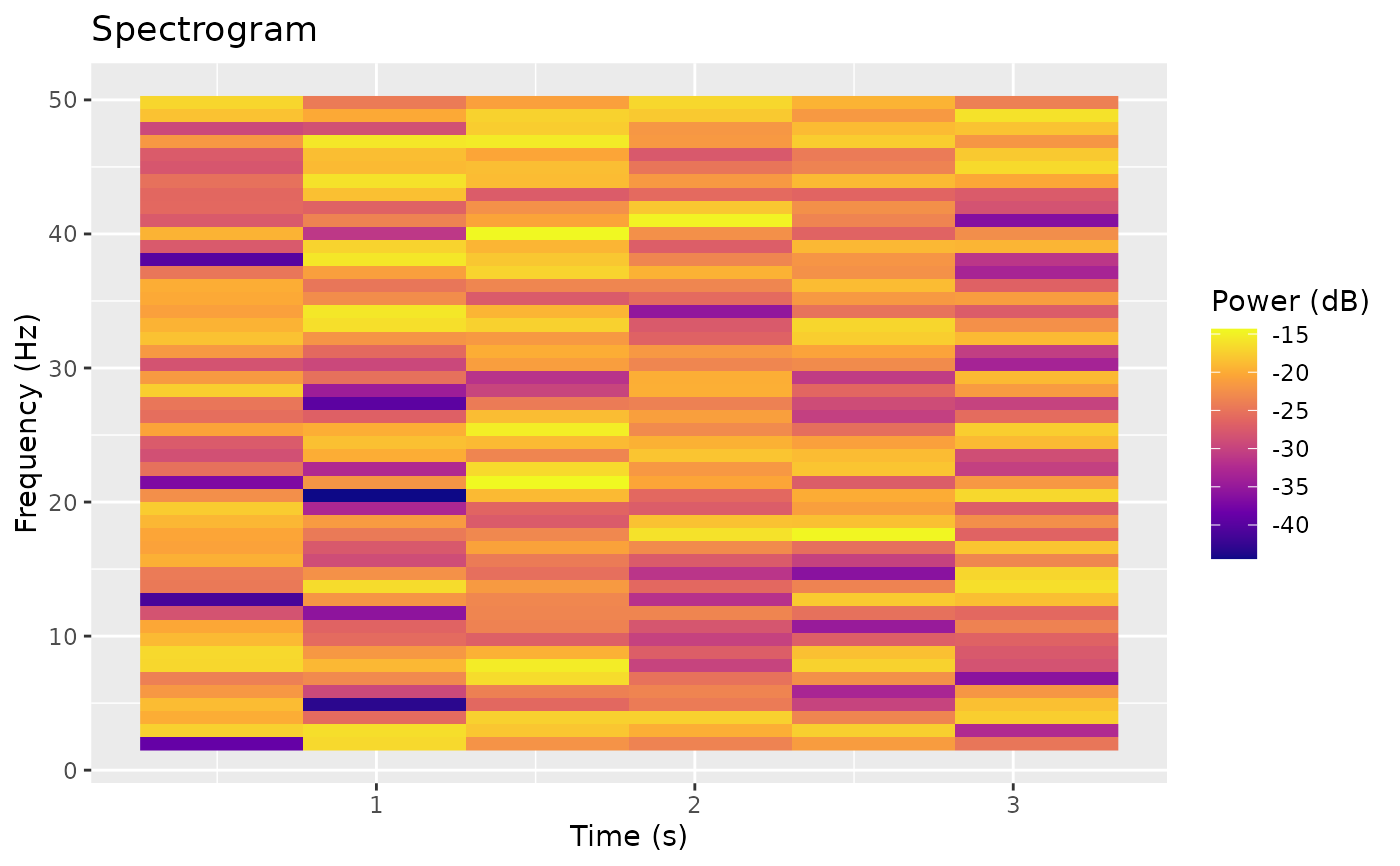
Creates a visualization of a spectrogram result.
Value
A ggplot object showing the spectrogram as a filled raster plot
with time on the x-axis and frequency on the y-axis.
See also
spectrogram() to compute the spectrogram data, plotPSD() for
power spectral density plots, plotSignal() for time-domain visualization.
Examples
pe <- PhysioExperiment(
  assays = list(raw = matrix(rnorm(1000 * 4), nrow = 1000)),
  samplingRate = 250
)

# Compute spectrogram
spec <- spectrogram(pe, channel = 1)

# Plot with frequency range filter
plotSpectrogram(spec, freq_range = c(1, 50))