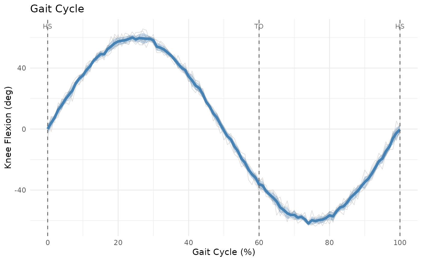
Plots waveforms normalized to gait cycle (0-100%) with options for displaying multiple trials, mean, and variability bands.
Usage
plotGaitCycle(
  x,
  events = NULL,
  normalize_to = 101,
  show_events = TRUE,
  show_mean = TRUE,
  show_sd = TRUE,
  show_individual = TRUE,
  event_labels = c(HS = 0, TO = 60, HS = 100),
  title = "Gait Cycle",
  ylab = "Value"
)
Arguments
- x
A PhysioExperiment, matrix, or list of matrices.
- events
Optional data.frame with gait events (heel strike, toe off).
- normalize_to
Length to normalize (default: 101 for 0-100%).
- show_events
Logical; show vertical lines at gait events.
- show_mean
Logical; show mean waveform.
- show_sd
Logical; show SD bands.
- show_individual
Logical; show individual trials.
- event_labels
Labels for gait events.
- title
Plot title.
- ylab
Y-axis label.
References
Wickham H (2016). "ggplot2: Elegant Graphics for Data Analysis." Springer.
Winter DA (2009). "Biomechanics and Motor Control of Human Movement." 4th ed. John Wiley & Sons.
See also
plotWaveformComparison() for multi-group comparisons,
plotSpaghetti() for individual waveform overlays,
calculateGaitParameters() for computing gait metrics.